top of page

Richard Park is a Product Designer based in New York.

Registry
IN-STORE MODE
MAMMA MIA!

CNBC article describing Bed Bath & Beyond's registry's rapid decline
which was the impetus behind leadership's request for Registry In-Store Mode
Registries are very important to most companies because they create customer loyalty and registry purchases tend to have tighter margins. To many people, Bed Bath & Beyond is synonymous with registries. At one point, Bed Bath & Beyond led the listing penetration share of registries. As such, much of the company's business is heavily reliant on the success of its registry.
Shortly after the New Year, the CNBC article above was published discussing Bed Bath & Beyond's rapid decline in listing penetration of registries (30%), especially compared to competitors like Amazon (45%). This caused the board and leadership to panic, especially with a wedding boom expected in 2022.
How could Bed Bath & Beyond quickly regain its dominance in registries?
The Challenge
increase registry usage via registry in-store mode
As an emergency response to the article, leadership tasked the Product and UX teams with creating and launching a digital solution within 6 weeks to help the company regain its registry dominance.
One team was tasked with improving the current registry experience on web, while my team was assigned to create Registry In-Store mode.
The initial high-level instructions from leadership was for us to make Registry In-Store Mode a feature on the app that enhances the registry experience for customers who shop in physical stores.
Leadership believed that Registry In-Store mode would increase registry activity via giving people an additional and easy way to add to their registries, as well as bring media attention to the area.
Due to the aggressive deadline, ambiguous initial requirements, and limited resources, we had to work in a truly Agile manner.
Duration of Project
6 Weeks/3 Sprints (from initial conceptions to launch)
My RolE
With guidance from my UX Manager, as the only remaining designer on the App Team, I led the design of the project. I also had the following responsibilities:
-
Gathering requirements
-
Understanding dev limitations
-
Research and synthesis
-
Wireframing and Prototyping
-
Dev handoff
-
Bug testing
Tools used
-
Invision Freehand and Figjam: brainstorming/workshops
-
Figma: wireframing and prototyping
-
Zeplin: handoff to devs
-
Jira: manage subtasks and report bugs
-
Microsoft App Center: test demos for bugs
Research & Synthesis
figuring out what to build
Initially, the only instructions leadership gave was to make Registry In-Store Mode a feature on the app that enhances the registry experience for customers shopping in physical stores. We had to navigate through the ambiguity and figure out the rest of the details.
We had to answer the following questions:
-
What kind of features would enhance the in-store registry experience for users?
-
What features from the existing web registry do we need to carry over to Registry In-Store Mode? Are the two experiences so intertwined that leaving out a feature from web would break the overall registry experience?
-
What can we practically design, test, and launch in just 6 weeks?
-
What limitations does dev have with the resources they have? The project potentially could involve complex designs and tech.
MEETING OF THE MINDS
Due to the aggressive launch date, we did not have time to conduct traditional research. Luckily, what we did have was access to the digital registry team and the physical store registry team who provided us with invaluable knowledge.
Through multiple separate and joint meetings with them and dev to see what was possible from a tech and time standpoint, we came up with a tentative list of requirements.
Although we spoke to teams simultaneously, we also followed a logical order, which facilitated an eventual filtering down of requirements. The requirements would often change during design and even development.
Below is a summary of information we gathered from each team.
-
Registry Team (Physical Stores)
-
Most customers who come to the registry department for help are registrants, not gift givers.
-
Customers often come to the registry department and ask for help starting a registry.
-
Customers' top activity, not surprisingly, is adding items to their registry. This was also the most important activity to the Registry Team.
-
The team wanted to promote a post-event experience.
-
-
Digital Registry Team
-
The team emphasized making registry sign-up seamless and fun
-
The team verified that the most important and frequently used feature on registry is registrants adding to their registries.
-
They stated that the web focused on the following features (in order of importance):
-
Hub showing registry name, event date, and status of gifts added and received
-
My Items: A list of items they added to their registry
-
Checklist: A Bed, Bath, & Beyond curated list of suggested items that registrants can add to their registry
-
Thank You List
-
Gift Giver
-
-

Current Registry Hub

Current My Items Section

Current Checklist Section

Current Thank You List Section
-
Development Team
-
Creating a native registry creation page within Registry In-Store mode would be a huge undertaking, especially since the current one is full of bugs
-
Versions of the Registry Hub, My Items, and Thank You list should be feasible if we do not stray too far from the current designs, considering no new APIs would have to be made
-
Due to the complex nature of augmented reality and use of a 3rd party vendor, any designs related to that area should leverage pre-existing designs from the "regular" In-Store Mode
-
Feature Prioritization
After meetings with the UX Manager, PM, and the aforementioned teams we came up with the following required features required/not required for the MVP (for the time being, as they would change during design and dev):
In Scope:
-
Registry In-Store Mode will initially be registrant-focused, with an emphasis on adding to the registry
-
The most critical aspect of the registry is for registrants to add items to their registry. Without registries, gift givers cannot purchase items.
-
-
Ability to add to registries to My Items via augmented reality
-
This is a non-negotiable since this is the main feature registrants use
-
Dev can leverage pre-existing tech and designs to save time
-
-
Registry Hub featuring registry name, event date, items added, items purchased
-
This is also a non-negotiable because this information is critical to the registrant and is also featured on all platforms the registry exists on
-
Dev can leverage existing APIs
-
-
Checklist and Post-Event experience would be nice to have, but are not critical to the stakeholders
Out of Scope:
-
Native Registry Creation (Account)
-
This was the biggest compromise we had to make, considering its importance to registrants first deciding to create a registry in stores. However, the Registry team understood the challenge and were ok with forgoing this feature for the MVP
-
Dev stated that this would be too hard to create natively in Registry In-Store Mode with the time we had, especially since the current registry creation section has extensive bugs
-
As a workaround, registry creation would have to be made outside of Registry In-Store Mode, until 2.0 is released
-
-
Thank You List
-
All teams agreed that this was not necessary for a registrant to have while they are inside a store
-
-
Gift Giver Experience
-
Since this was not a main focus for any of the stakeholders and would entail creating an entire new native experience within In-Store Mode, we decided to save this feature for 2.o
-
Design
designing on the fly
Typical with Agile, the design portion of the project did not have a clear start or end point. Some designs started before we got all the requirements and some were altered because dev was running behind. With some quick and creative thinking we finally created designs that worked for all teams.
initial brainstorming Workshops
With a tight deadline, we hard to start designing before we got all the requirements from leadership and the PM. Luckily, at the time, I had access to the Digital Registry Team, who brainstormed with me in a few workshops (InVision Freehand and FigJam ftw) to create initial designs. Although requirements changed after these designs, a lot of the ideas were seeds that eventually turned into features we would use.

Early designs made in FigJam


Early designs made in InVision Freehand
The initial designs can be summed up into two approaches.
When the Senior UX Designer and I were making the original "regular" In-Store Mode, one of the requirements was to make a Product Scanner and a Scan & Buy feature and place them in separate areas (one button for each on the hub). The Product Scanner gave the user details on an item, while Scan & Buy allowed users to quickly purchase an item on their phone. We thought these two scanning options in separate section was redundant and should be combined into one scanning section.
The first approach involved revisiting our combined scanner idea and have one scanner area where you could toggle between the different functions of the scanner, including adding to your registry.
The second approach involved creating a totally separate experience for registry with its own registry scanner.
Feedback
I showed these initial designs to leadership and dev so that I could get a better idea of the direction to take.
Leadership asked that the Registry In-Store Mode be its own special experience, almost on par with "regular" In-Store Mode. This meant that I had to move more in the direction of the aforementioned second approach and nix the combined scanner idea.
Dev mentioned that the multi-function scanner would be very difficult to implement due to its complexity and working with an external vendor Scandit. Once again, they emphasized leveraging existing designs if possible.
Hi-Fidelity Screens
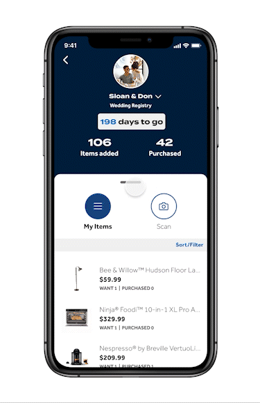
From the research and feedback I received, I decided to create a distinct experience separate from "regular" In-Store Mode, with a focus on the Registry Hub, My Items (registry list), and ability to scan to add to your registry. I came up with the following main screens of Registry In-Store Mode.

(i) Registry Hub Default
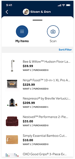
(ii) My Items Overlay Pulled Up

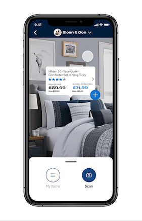
(iii) Scan to Registry Mode
The different states of the main screen can be toggled either through tapping the My Items/Scan buttons or pulling the overlay tap up and down.
The default state of the main screen shows the (i) Registry Hub. It contains all the same information from the existing Registry Hub (dev was happy they didn't have to make new APIs).
When you pull the overlay up, you are able to see more of (ii) My Items (registry).
When you tap Scan or pull the overlay tab all the way down you gain access to the Add to Registry Scanner.
Due to time restraints and dev resources, the Checklist and Post-Event features would have to be in the 2.0 version.
Reclaimed wood (development)
Once again due to the aggressive timeline, I had to make sure the designs I made could be developed in time. For the Scan to Add to Registry function, dev reiterated the need to stay close to what was developed for the "regular" In-Store Mode.
A mutually agreed on approach was to simply add a (+) sign to the bottom right of the existing augmented reality module that pops up when scanning an item.

Product Scanner from
(Regular) In-Store Mode Production
Product Scanner from
(Regular) In-Store Mode Production

Scan Mode featuring the same AR Module except with a (+) added
What IF (the registrant has multiple registries)?
While I was designing, I discovered a scenario that was not accounted for when we originally scoped the project. The scenario involved a registrant having multiple registries. Although, considered an edge scenario, I still accounted for it my designs. In case dev could not complete this feature in time, as a fail-safe, the PM and I decided to have the most recently created registry appear as default.

Untapped Registry Header

Tapped Registry Header

New Registry Tapped

New Registry Header
Happy Path Flow
DELIVERY
manifesting designs
into production
Design Handoff
For each Jira subtask ticket (which usually covered a specific feature to be developed), I attached a link to a Zeplin file, where I uploaded all my screens from Figma to. The Jira ticket would be linked to the assigned developer for the task so we could communicate in case there were any questions regarding the designs.

Screenshot of a typical Zeplin file I would link to Jira tickets
if a picture is worth a thousand words, then a prototype is worth...
Sometimes developers have trouble understanding how some of the assets move on the screen. Below are two examples of prototypes I made to help explain to the developers how certain features worked.
I made this prototype in Figma to explain to a developer how the hub fades away and the registry name on the header appears as a user pulls the overlay tab all the way up.
This is another more advanced prototype I made in Figma. Here, when the user taps the augmented reality module, a PDP pulls up while the background becomes darker.
The user then has the option to either pull the overlay tab back down to reveal the My Items and Scan overlay, or the user can tap outside the overlay to dismiss it.
This was tricky to accomplish in Figma as I had to use some workarounds to accomplish what I wanted to show.
Call the bug exterminator
Of course, no project is not without its bugs. I downloaded a demo on both iOS and Android using Microsoft App Center. I then ran tests to find any bugs (spoiler alert, there were).

I downloaded a demo to test on Microsoft App Center
Once I found the bugs I recorded them as either screenshots or videos and attached the respective file to a Jira ticket. I labeled tickets as either high or low priority as warranted. I also kept tabs on each bug to see if they were fixed correctly.


Jira Bug Ticket Ex. 1


Jira Bug Ticket Ex. 2
Fin!
After all bugs were fixed, we were ready to launch. The real MVP was launched on time in a handful of pilot stores. We demoed Registry In-Store Mode during a company-wide call and received very positive feedback.

Bad MVP Pun
Outcome and Reflections
Although stressful due to the aggressive launch date, the experience taught me how effective Agile can be. It also taught me the importance of relationships, clear communication, and working as a team.
The next steps for this project include implementing analytics to improve the experience and to see if we are in fact positively impacting our registry.
We would also like to get direct feedback from the Registry Department that keeps close tabs on the registry experience in physical stores.
Finally, we want to implement all the features we could not for the MVP into version 2.0, including Checklist and the Post-Event experience.
bottom of page